Front covers
Analysing existing music magazine front covers has helped me with my own magazine. I have found that most magazines use a medium close up or close up as the cover image, and a distinct theme in the colours on the page. I also know that the front cover is aimed specifically at the target audience, for example the music artist on the cover will be of the genre that the target audience is interested. I know that the appearance and content of the masthead, subhead and sell lines is also important as they attract the reader to the magazine and may convince them to purchase it.
Contents Page
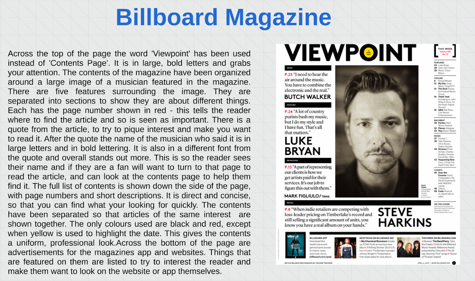
I have learnt that having a good structure to the contents page is important so that it is easy to read and find pages. It should also be in chronological order. Using images and quotes from articles act as a hook and draw the reader in. Also certain articles should be separated into categories regarding their topic, for example 'Interviews'.
Double Page Spread
I have found that the main image on a double page spread should take up about half of the article (in this case the full first page). When the article is an interview, it is important to have the questions and the answers clearly distinguished so as not to confuse the reader. Using pull quotes can also help to grab the reads attention and draw them in.


No comments:
Post a Comment