Tuesday, 21 October 2014

Blog Feedback

Positive Feedback:
  • Wide range of programmes used (e.g. Prezi, Slideshare)
  • Very detailed
  • Appropriate use of statistics
  • Good understanding of tasks
To improve:
  • Upload reader profile
  • Upload colour shceme and font post
  • Provide explanations on some posts


I agree with the comments and I am going to modify my blog to suit this. I uploaded my reader profile just after the feedback was completed and my fonts/colours posts will be uploaded as soon as it is completed. I am also going to going through my work and see if there is anywhere I could add an explanation to improve it.

Reader Profile


This is my reader profile which gives an overall view of my target audience, detailing their jobs, incomes, ages and interests etc. 

Wednesday, 15 October 2014

Magazine Institututions - My Decision

The media institution is very important in to making a magazine. It is involved at every stage - the institution contributes to the production of the magazine, as well as with the marketing to increase its popularity and the number of issues sold. It is also involved in where the magazine is distributed - which shops it is in for the customer to purchase it. To successfully produce and sell your magazine, it is essential to be represented by an institution that can cater for its needs efficiently. 
Based on my research, I have decided that I would want my magazine to be represented by Bauer Media. They are the UK division of the Bauer Media Group, which as a whole owns over 300 magazines in 15 European countries, as well as websites, TV and radio stations. Bauer Media own three well known music magazines - Q, Mojo and Kerrang! - which are arguably the most successful of their genres on the UK market. Q, for example, was read by 369,000 adults in June 2012. The majority of its audience was of the age range 15-34 (62%)  with the age range 35-44 having 20% of readers. This shows that the readership is primarily younger readers with a secondary target audience of people slightly older. 70% of its readers were of the ABC1 socio-economic class, meaning the majority have reasonable income to spend and are more educated.
In my opinion Bauer Media would have more experience with a music magazine than other institutions - for example EMAP, which releases informative publications concentrated within industries, as opposed to lifestyle magazines (music, fashion etc). I think being published by an institution such as Bauer Media would make my magazine look better, as they have a good reputation within the media industry. I have researched the current music magazines they represent and all of them - despite being of different genres - attract the same type of target audience - young adults onwards, mainly of the ABC1 socio-economic code. This is the target audience I want my magazine to appeal to so I think that the institution would know how to attract them. They would also know how to advertise it and where to distribute it so that it would be in the focus of the target audiences mind.


Q Magazine reader profile 

Monday, 13 October 2014

Evaluating Previous Work

This is a previous students music magazine that I analysed in a group with people in my class. We have done this to get a better understanding of what we need to do when it comes to making our own magazine. We gave this magazine a B overall, with individual marks for the front cover, contents page and double page spread.
We gave the front cover a B+. We thought that it was very well suited to its genre (rock), due to the font and colors. This person seems to have taken inspiration from Kerrang Magazine. The effect on the text to give it a worn appearance looks professional and matched the look you would expect 'Dragon Genocide' to have. We also thought the photograph stood out and caught the readers eye. We thought that to improve, more sell lines should have been used, as the three not relating to the cover artist were clumped together and were quite small, making them harder to read. Part of the reason for this may have been the closeness of the image, as there may have been an issue with sell lines covering parts of her head. We thought the image should have been a medium close up instead, so that there was more room for sell lines to be spread out over the page. Overall, though, we thought that this was a good front cover that showed understanding of what would attract the target audience. It also looks professional - the essential information and barcode are displayed as they would be on a real magazine.
We gave the contents page a B. It fit its purpose well - the articles were listed in chronological order with page numbers that were easy to read, and each piece of content was sectioned into one of three three catergories ('News', 'Reviews' and 'Interviews'). The colour scheme was  the same as the front cover - black, red, white, yellow and red - and matched the genre. Despite this, we thought the contents page overall looked slightly rushed, and more cauld have been done to make it look like existing magazines. The contents only lists up to page 43, whereas most magazines have at least 80-90 pages. We thought she could have added more to her contents page to make it appear there were more articles. We also thought she could have used a variety of different fonts for each catergory, as it would have grabbed the reader's attention and drtawn them in to each piece of information. We also thought that the image she used should have been a different person to the front cover, as it there would be something different for the reader to look at and it would show she had gone to the effort of interviewing/photographing more than one artist for her magazine. The contents page overall is suitable for the magazine and shows information clearly, however we thought more could be done in the design to make it look more professional.
We gave the double-page spread an A. For us, this was the best part of her magazine, as it looked professional and in keeping with the rest of the magazine whilst still interesting to the reader. The image of the artist is large and clear, and looks attractive to the reader. The artist's face stands put against the background of the image which catches the reader's eye. The image takes up about half of the double-page spread, which you would expect, as it reduces the amount of text there is to read. The article's title is a quote from the interview, which is clever as it hooks the reader in to read on. The interview is written in the style of an existing magazine. The questions are written in red and the answers in white, which clearly differentiates who is speaking at the time. It has been displayed in columns and it is easy for the reader to see where the next piece of text is. To improve, a pull quote could have been used somewhere on the double page spread, as this may further interest a reader in the article's content and covince them to read on.

Wednesday, 8 October 2014

Focus Group Feedback Analysis

Question 1: Comments on name

  • Jacob stated that "The title is appropriate to the articles". I would agree with this feedback because the artist on my magazine cover will be someone who has popular music and may influence you to buy their single/album etc.
  • Ellis stated that "The name links with the theme of the magazine". I am going to try to make it clear what the magazines genre/sub-genre is and why it is called Influence. I may use a slogan such as 'New music now' to show the magazines about the newest, most popular music of the times.
Question 2: Comments on front cover / double-page spread
  • Hannah stated that "Using a guitar as a prop on the front cover suggests the artist has music talent and may interest people in the double page spread". I agree with Hannah, and for this reason I am going to use a guitar. If the target audience sees they have a musical instrument this may interest them more to know they can play as well as sing. They then may be more likely to buy the magazine and read the interview inside.
  • Emily stated that "An interview is more interactive with the reader than a feature and should therefore be used for the double-page spread. Using sell lines will help to attract the target audience". I agree with Emily as I think the reader can connect more if they know the words written were actually spoken by the musician and feel like they find out more about them. I will take her advice and use sell lines also, as they may catch the readers eye bring their attention to the magazine.
Question 3: General comments
  • Robyn stated that "The front cover's image will draw the reader in to the main article (double-page spread). I suggest advertising a music-based competition or offer within the sell lines (for example winning concert tickets) to further attract the reader". I am going to take note of Robyn's comments; it is a good idea to advertise a competition as it may convince someone to purchase the magazine. If it is music based as she suggested it will suit both the target audience and the socio-economic code - people with some money to spend, but not necessarily enough to afford to go to a concert regularly.
  • Jacob stated that "There are some good ideas proposed and the simple nature of the magazine will make it achievable within deadlines. Be careful not to over-simplify in case the magazine looks boring". Taking this into account, I am going to work on putting comments from the feedback of the focus group into practice, for example catchy sell lines and competitions.
Question 4: Comments on colour and image use
  • Ellis stated that "The colour scheme of red, black and white are gender neutral which appeals to the masses". This is what I am aiming for, as I want the magazine to be able to engage a wide target audience rather than one specific small group.
  • Robyn stated that "The colour scheme is good as they are not gender specific colours. Try to use each colour for certain things so they have a uniform style". I think this is a good idea. I will try to separate each colour so that they have a purpose, for example using red for the masthead, using black for sell lines and white for essential information (date, price). I may also try and use a bright colour such as yellow to advertise a competition or special offer, as it will stand out from everything else.

Focus Group Feedback

 Feedback
Feedback


These are two examples of the feedback forms I received from people in my focus group about my magazine. 

Thursday, 2 October 2014

Questionnaire Results


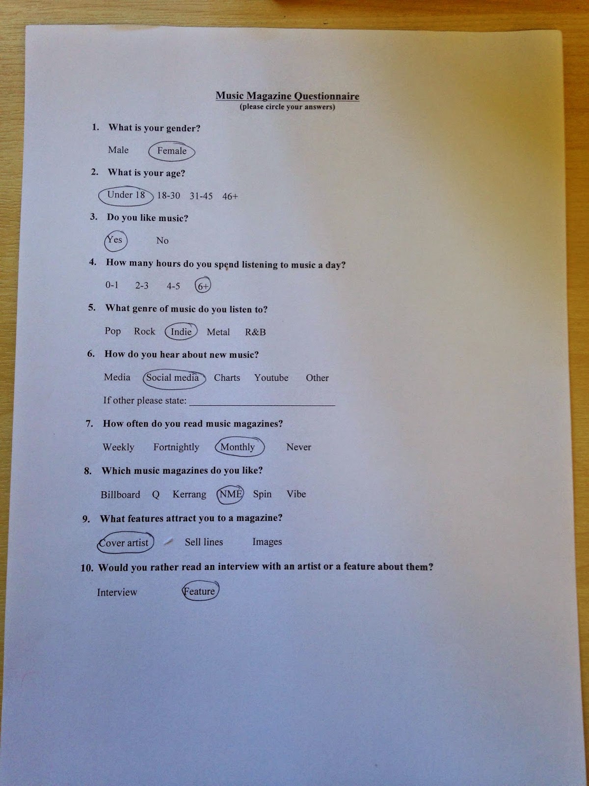
This is an interpretation of my results from the questionnaires. I compiled the answers from each question into tables, and using this data created a pie chart for each question that clearly shows the opinions of the sample.

Questionaire


These are some examples of the questionnaires I used to carry out research and my results.