Tuesday, 31 March 2015
Monday, 30 March 2015
Tuesday, 24 March 2015
Tuesday, 17 March 2015
Tuesday, 3 March 2015
Final Versions of Magazine Pages
Front Cover

Double Page Spread
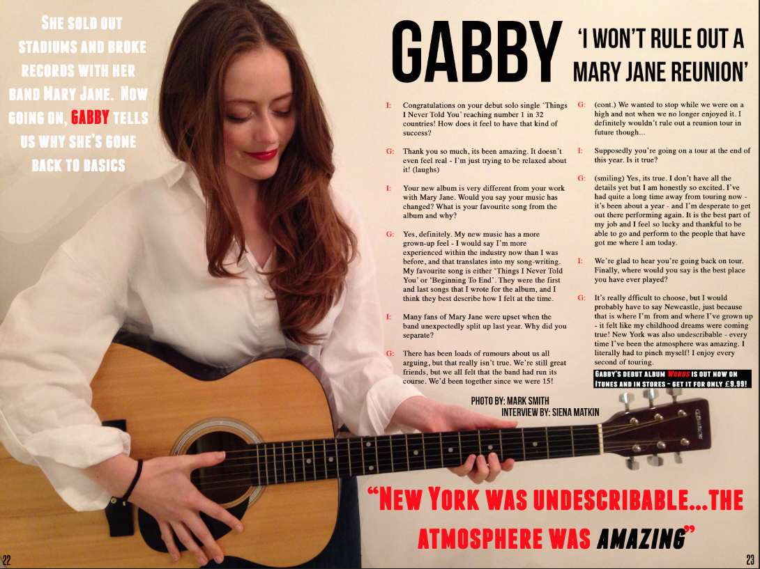
This is the final version of my double page spread for my music magazine. I think it meets the needs of both my primary and secondary target audience because it has the general conventions of a music magazine DPS. The heading is big and bold, which makes it easy to read and the sub heading is a continuation from that. The image of the musician holding a guitar further supports the idea this is an article about music and anchors the test surrounding it, for example the introduction to the interview next the model's head. The model's costume is also significant as it matches the color scheme of the article without distracting from the interview dialogue. I have used a pull quote which I think will get people's attention if they were flicking through the magazine and the bright colours and bold text make it eye-catching. I have continued the colour scheme of red, white and black in keeping with the rest of the magazine which I think helps as it highlights certain part of the text designed to be important to the reader. The interview itself is set out in a different font so that the smaller writing is easy to read. it has been positioned so that sections of text are separated - which makes it easier to see who is saying what. I have also included a piece of text at the end of the interview which gives details on when and where the album is available and the price. This would appeal to the target audience as they are interested in this genre of music and may want to purchase the album themselves.
This is the final version of my front cover for my music magazine. I think that it appeals to my target audience because the various sell lines are directly linked to the genre, for example the various artists whose names have been used to attract readers. The colour scheme of the front cover have been put in place to appeal to both the primary and secondary audience, which I personally think they do as they are gender neutral, like my audience.
I think that my front cover provides a good representation of the pop/indie genre because it uses the conventions that would be expected of pop/indie magazine. I have based the pricing of my magazine on my research into the socio-economic code of my target audience and what they would find suitable to pay. I have also provided a barcode, issue number and date as seen on a real magazine. I also think that the appearance of the magazine matches the expected conventions in terms of my layout. My masthead is where it is expected to be in the left side third which makes it easy to find and eye-catching. My front cover image is the main focus of the page and I feel this is supported well by the way it is anchored to the main sell line. There is a clear link between them as the main sell line and sub-head are displayed directly across the artist's body. This further helps the image and the sell line to be the main focus of the page.
Contents Page
This is the final version of my contents page for my music magazine. I think it appeals to both my primary and secondary target audience because it is clear and concise in terms of layout, which makes it easy to read. So therefore it is easier to find the page that you are looking for. I have continued the colour scheme of red, black and white from the front cover which I think have helped to highlight the important parts of the content for the audience to read. It appears a conventional contents page for a music magazine, because I have separated the contents into sections based on the type of article they are. This method is often used in magazines such as Q and NME, which I took inspiration from when designing my magazine. I think it appeals to my target audience because they are of a relatively young age and will generally be using social media, and so my contents page shows the magazine is current in understanding their interests. Both my primary and secondary image are easy to see and made more interesting by pull quotes and tag lines. They also have to the page numbers given so that it is easy to find them and both are featured within the contents list which makes them seem more relevant to the magazine.

Double Page Spread
This is the final version of my double page spread for my music magazine. I think it meets the needs of both my primary and secondary target audience because it has the general conventions of a music magazine DPS. The heading is big and bold, which makes it easy to read and the sub heading is a continuation from that. The image of the musician holding a guitar further supports the idea this is an article about music and anchors the test surrounding it, for example the introduction to the interview next the model's head. The model's costume is also significant as it matches the color scheme of the article without distracting from the interview dialogue. I have used a pull quote which I think will get people's attention if they were flicking through the magazine and the bright colours and bold text make it eye-catching. I have continued the colour scheme of red, white and black in keeping with the rest of the magazine which I think helps as it highlights certain part of the text designed to be important to the reader. The interview itself is set out in a different font so that the smaller writing is easy to read. it has been positioned so that sections of text are separated - which makes it easier to see who is saying what. I have also included a piece of text at the end of the interview which gives details on when and where the album is available and the price. This would appeal to the target audience as they are interested in this genre of music and may want to purchase the album themselves.
Further Feedback
This is my contents page before my final feedback from my teacher.
This is the feedback I received.
These are the changes I made in accordance with that feedback.
Subscribe to:
Comments (Atom)


